Lesson 4: Data Visualization in R
Cavan Donohoe
Lesson 4 of 7 · Course overview
Data Visualization in R
Plotting in R is excellent. You’ve already seen plot() —
it works, but the real toolkit is ggplot2. It’s based
on a “grammar of graphics” that, once it clicks, lets you describe
almost any plot in a handful of lines.
This lesson covers the ggplot2 grammar, the most common geoms, faceting, themes, and how to save plots.
Setup
library(ggplot2)
library(dplyr)

cars <- mtcars |>
  tibble::rownames_to_column("model") |>
  tibble::as_tibble() |>
  mutate(
    cyl = factor(cyl),
    transmission = if_else(am == 1, "manual", "automatic")
  )
The ggplot2 grammar
Every ggplot2 plot has three required pieces:
- Data — the data frame you’re plotting.
- Aesthetics (
aes()) — which columns map to which visual properties (x, y, color, size, shape). - Geoms — the geometric shapes to draw (points, bars, lines, boxes, …).
The pattern:
ggplot(data, aes(x = ..., y = ..., color = ...)) +
  geom_*()
You add layers with +. Yes, + (not the
pipe). Inside a ggplot() call you +, between
data steps you |>. It’s a mild gotcha and you’ll get it
wrong a lot at first.
A first plot
ggplot(cars, aes(x = wt, y = mpg)) +
  geom_point()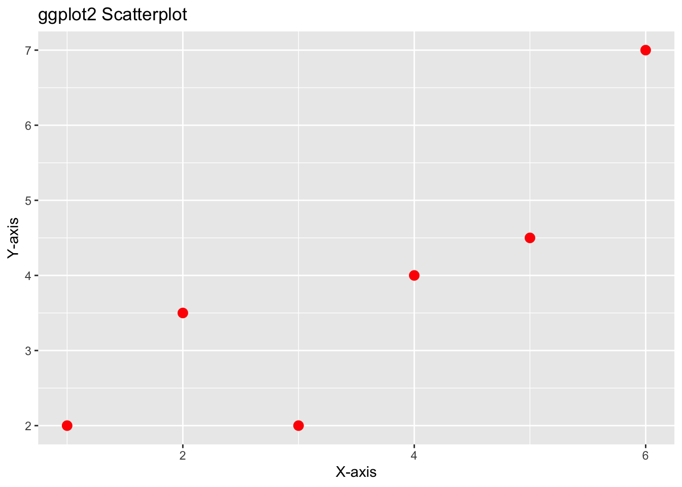
That’s the whole plot: data (cars), aesthetics
(wt on x, mpg on y), one geom
(geom_point for a scatterplot).
Now let’s add color, size, and labels:
ggplot(cars, aes(x = wt, y = mpg, color = cyl, size = hp)) +
  geom_point(alpha = 0.8) +
  labs(
    title = "Heavier, more powerful cars get worse mileage",
    subtitle = "Each point is a 1974 car model",
    x = "Weight (1000 lbs)",
    y = "Miles per gallon",
    color = "Cylinders",
    size = "Horsepower"
  )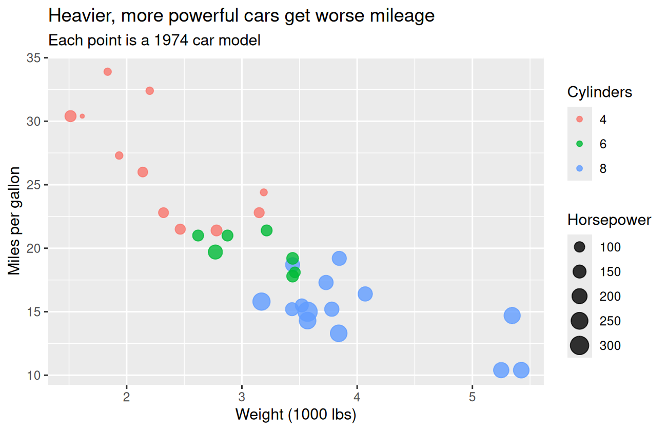
Notice three things:
color = cylandsize = hpare insideaes()because they map to data columns.alpha = 0.8is outsideaes()because it’s a fixed value (every point gets the same alpha), not a mapping.labs()controls every text label on the plot at once.
The most useful geoms
geom_point() — scatterplots
Shown above. Add geom_smooth() to overlay a regression
line:
ggplot(cars, aes(x = wt, y = mpg)) +
  geom_point() +
  geom_smooth(method = "lm", se = TRUE)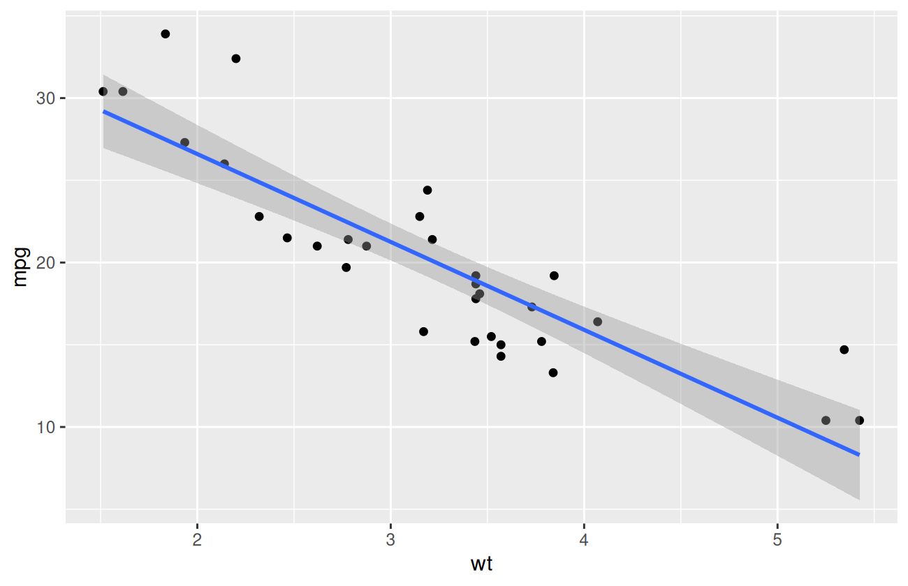
method = "lm" is a straight line; the default
"loess" is a smooth curve.
geom_line() — connect points by some ordering
year_data <- tibble::tibble(
  year = 2015:2024,
  sales = c(100, 108, 121, 119, 130, 145, 160, 158, 172, 185)
)

ggplot(year_data, aes(x = year, y = sales)) +
  geom_line(linewidth = 1.1, color = "steelblue") +
  geom_point(size = 2.5, color = "steelblue") +
  labs(title = "Sales over time", x = NULL, y = "Sales (units)")
geom_bar() and geom_col() — bar
charts
geom_bar() counts rows itself. geom_col()
uses the y-value you give it.
ggplot(cars, aes(x = cyl)) +
  geom_bar(fill = "steelblue") +
  labs(title = "How many of each cylinder count?", x = "Cylinders", y = "Count")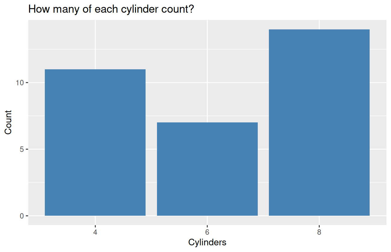
cars |>
  group_by(cyl) |>
  summarise(mean_mpg = mean(mpg), .groups = "drop") |>
  ggplot(aes(x = cyl, y = mean_mpg, fill = cyl)) +
  geom_col() +
  geom_text(aes(label = round(mean_mpg, 1)), vjust = -0.4) +
  labs(title = "Average MPG by cylinder count", x = "Cylinders", y = "Mean MPG") +
  theme(legend.position = "none")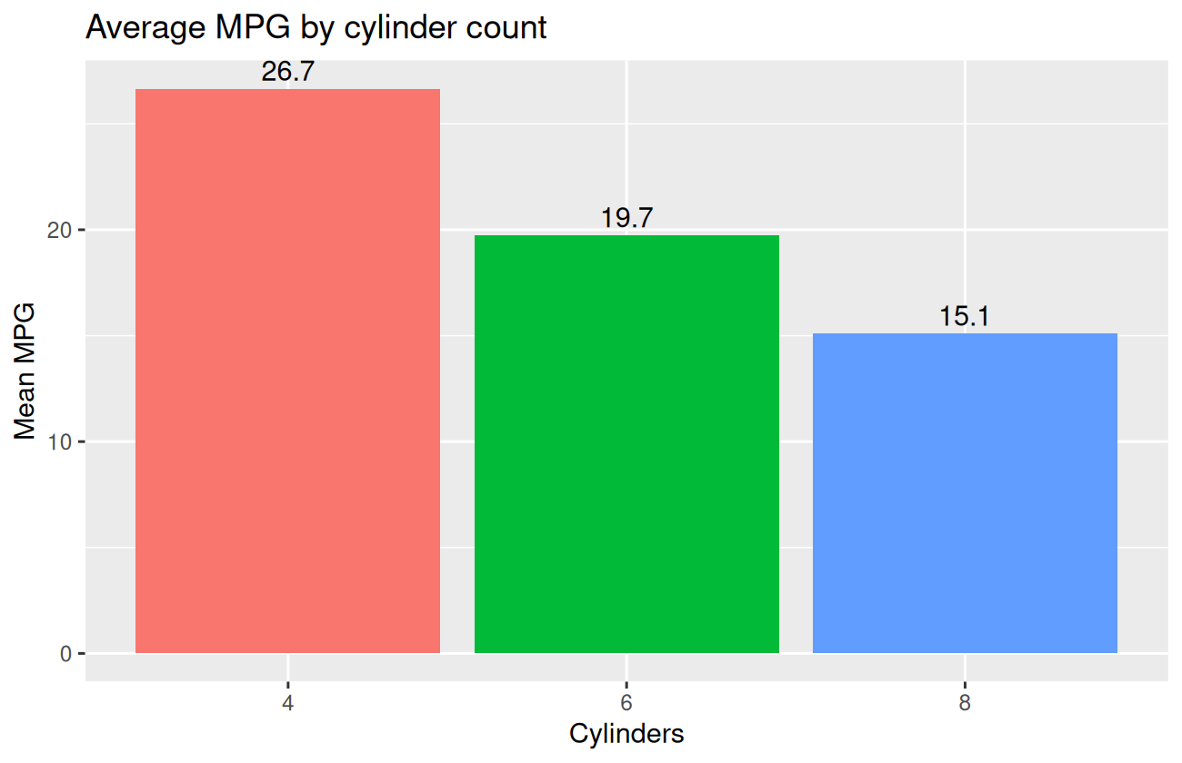
Notice we pipe a dplyr summary directly into
ggplot(). This is the standard tidyverse workflow.
geom_histogram() and geom_density() —
distributions
ggplot(cars, aes(x = mpg)) +
  geom_histogram(bins = 12, fill = "steelblue", color = "white") +
  labs(title = "Distribution of MPG across all cars", x = "MPG", y = "Count")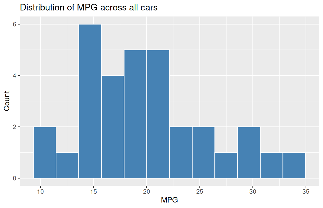
ggplot(cars, aes(x = mpg, fill = transmission)) +
  geom_density(alpha = 0.5) +
  labs(title = "MPG by transmission type", x = "MPG", y = "Density")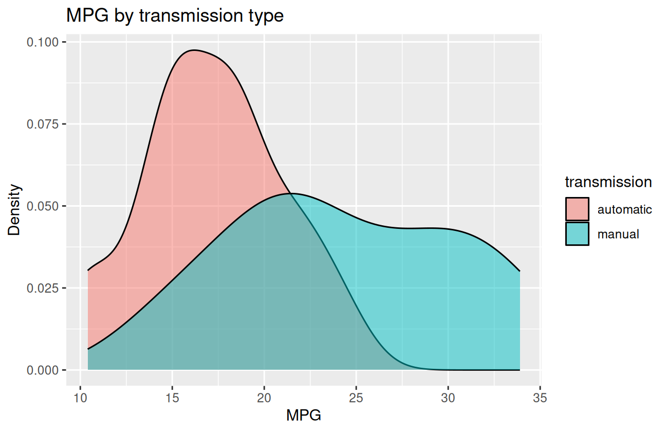
geom_boxplot() — distributions by group
ggplot(cars, aes(x = cyl, y = mpg, fill = cyl)) +
  geom_boxplot() +
  labs(title = "MPG by cylinder count", x = "Cylinders", y = "MPG") +
  theme(legend.position = "none")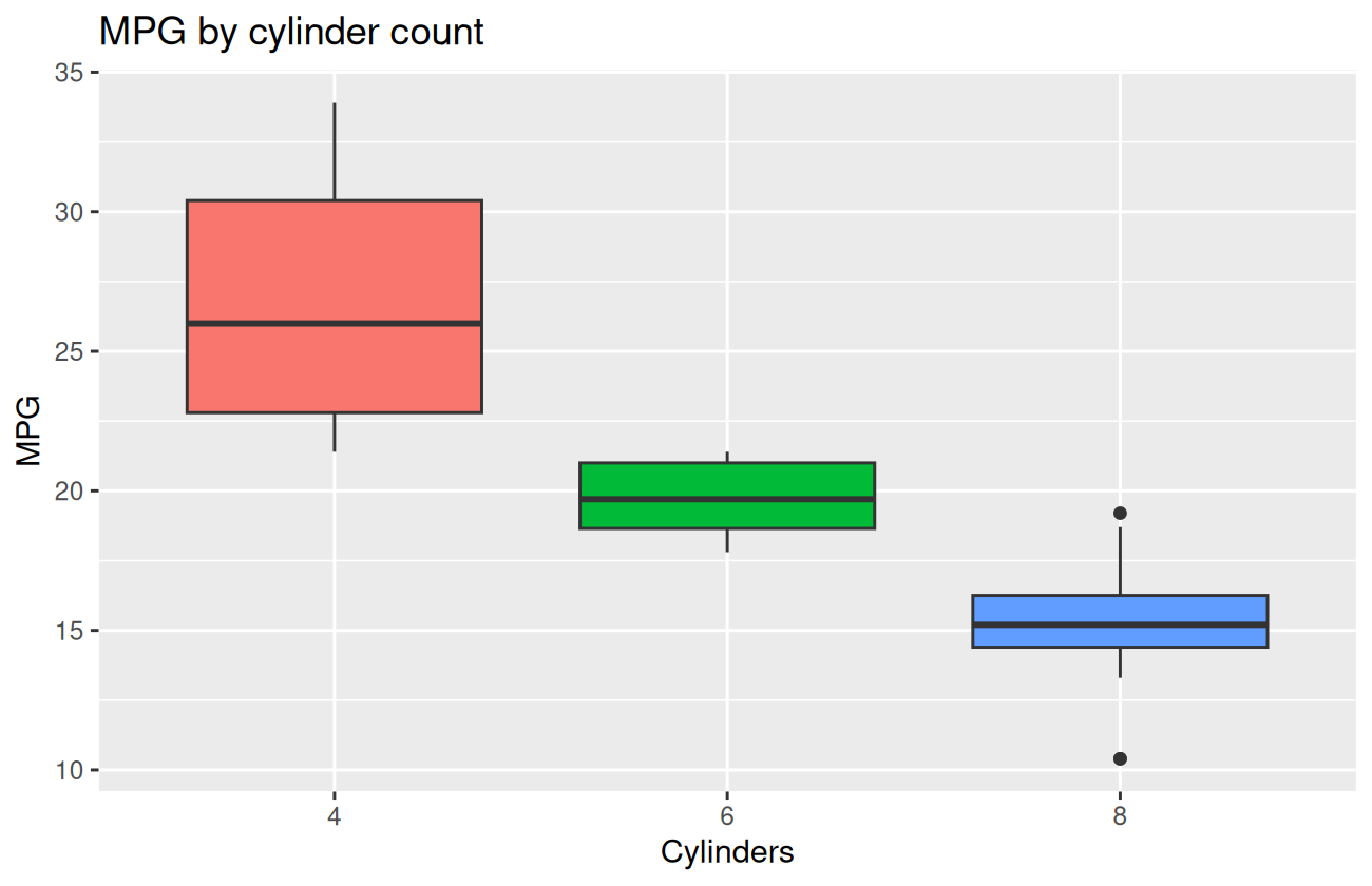
Faceting — small multiples
facet_wrap() and facet_grid() let you split
a plot into a grid of subplots, one per category. Often more informative
than mapping a category to color.
ggplot(cars, aes(x = wt, y = mpg)) +
  geom_point() +
  geom_smooth(method = "lm", se = FALSE) +
  facet_wrap(~ cyl, labeller = label_both) +
  labs(title = "Weight vs. MPG by cylinder count")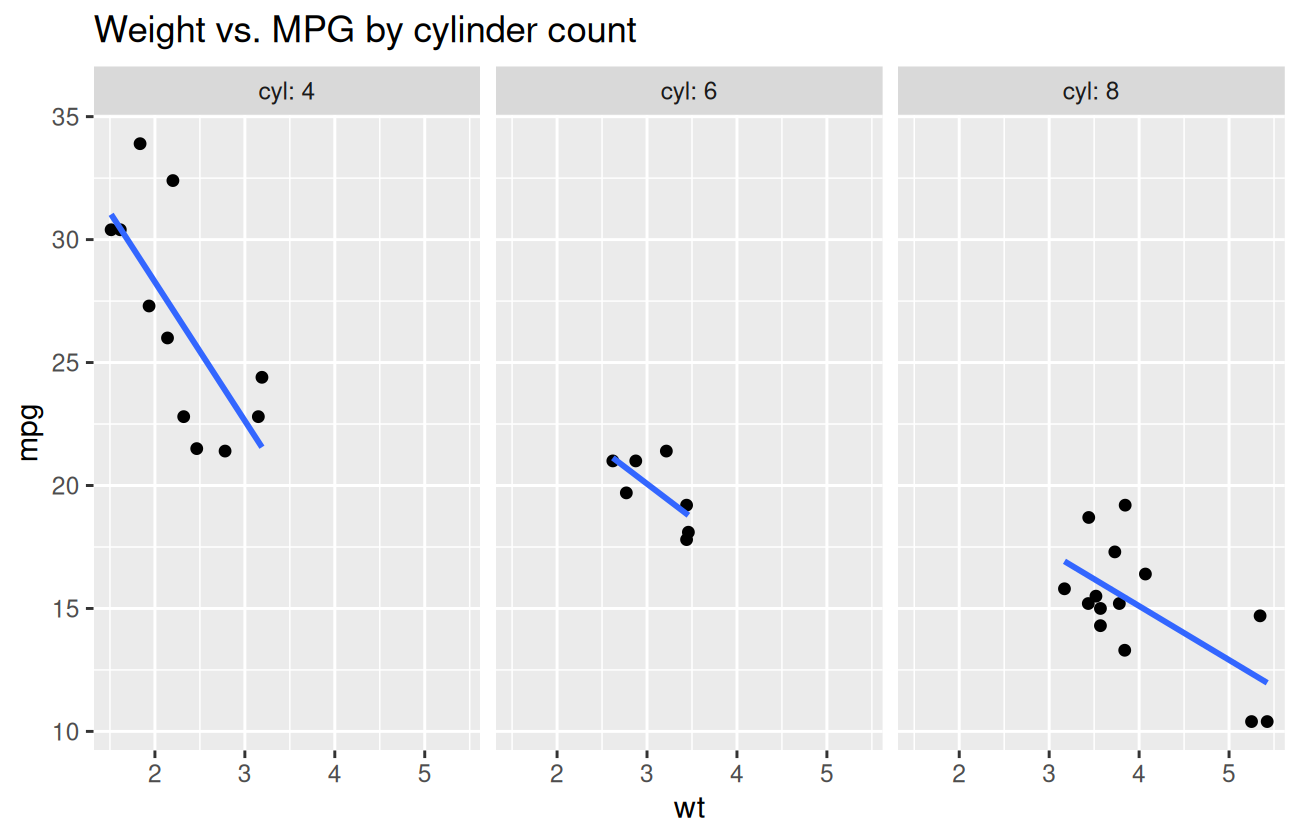
facet_grid() does a 2D grid of categories:
ggplot(cars, aes(x = wt, y = mpg)) +
  geom_point() +
  facet_grid(transmission ~ cyl, labeller = label_both) +
  labs(title = "Weight vs. MPG by transmission and cylinder count")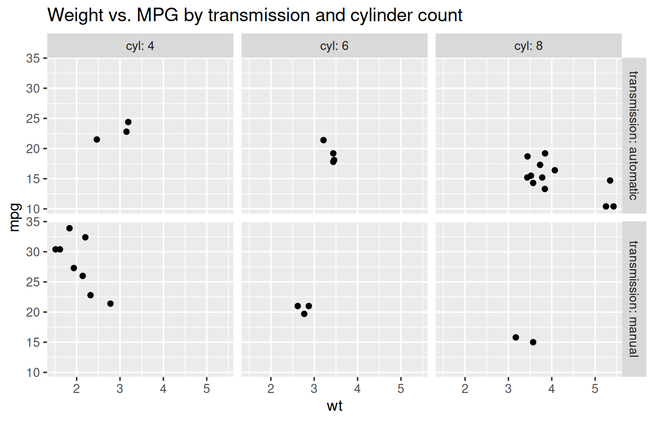
Scales — controlling axes and color
Scales control how data values map to visual properties. Common ones:
ggplot(cars, aes(x = wt, y = mpg, color = hp)) +
  geom_point(size = 3) +
  scale_color_viridis_c(option = "plasma") +
  scale_x_continuous(limits = c(1, 6), breaks = 1:6) +
  scale_y_continuous(name = "Miles per gallon") +
  labs(title = "Weight vs. MPG, colored by horsepower")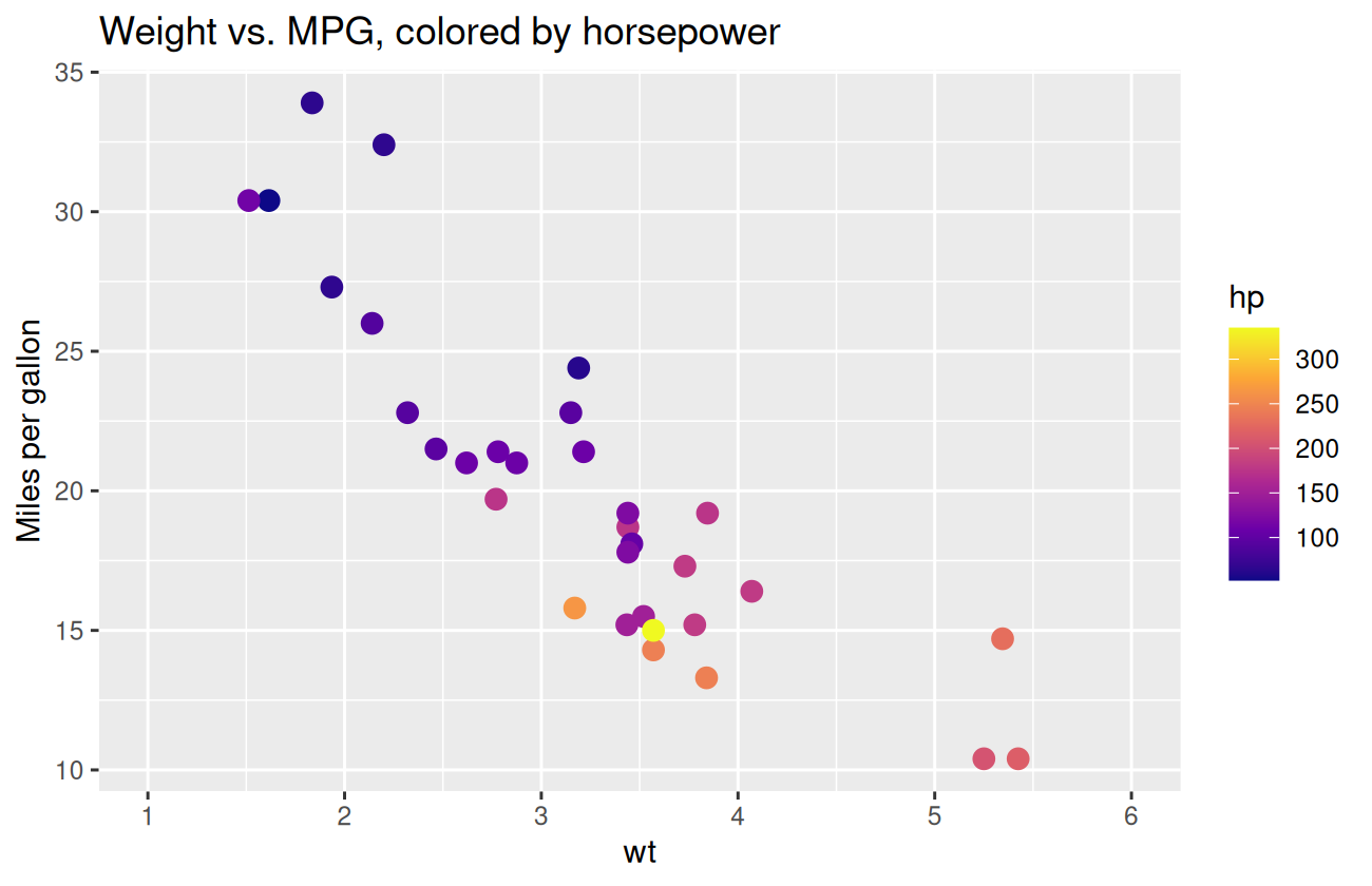
A few worth knowing:
scale_*_continuous()— for numeric axes; sets limits, breaks, labels.scale_*_log10()— log axis (useful when data spans orders of magnitude).scale_color_viridis_*()/scale_fill_viridis_*()— perceptually uniform, color-blind-friendly palettes. Use these.scale_color_manual()— assign specific colors to specific levels.
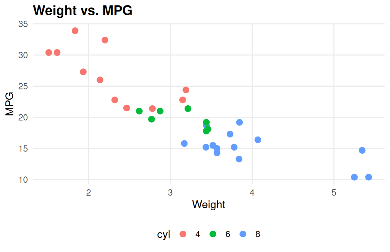
Themes — controlling the non-data ink
Themes change how the plot looks — gridlines, fonts, backgrounds. ggplot2 ships with several:
p <- ggplot(cars, aes(x = wt, y = mpg, color = cyl)) +
  geom_point(size = 3) +
  labs(title = "Weight vs. MPG", x = "Weight", y = "MPG")

p + theme_minimal()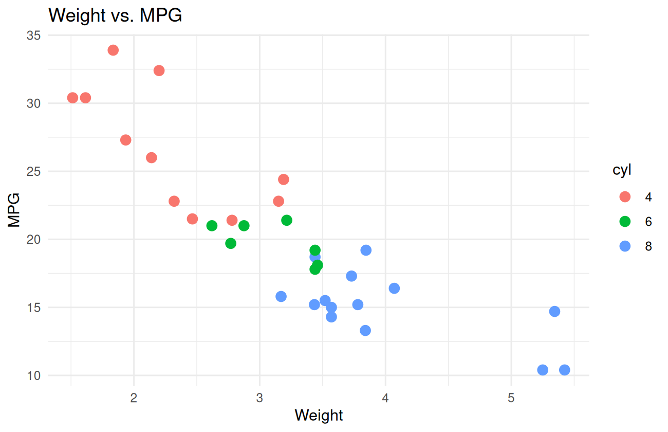
p + theme_classic()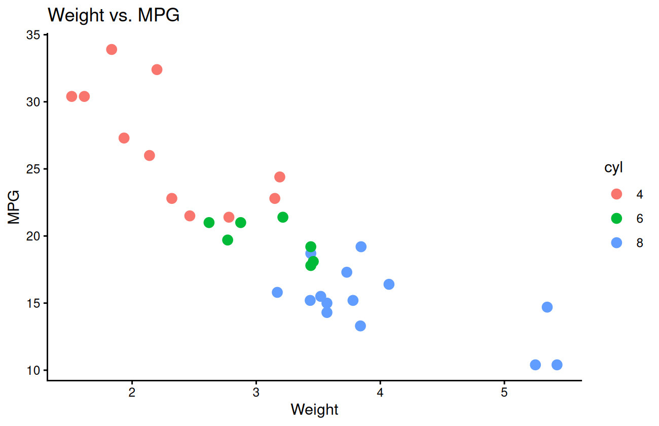
You can also tweak individual theme elements:
p +
  theme_minimal(base_size = 13) +
  theme(
    plot.title = element_text(face = "bold", size = 16),
    legend.position = "bottom",
    panel.grid.minor = element_blank()
  )
Setting a theme for the whole session:
theme_set(theme_minimal(base_size = 13))Saving plots
ggsave() saves the most recent plot — or one you pass to
it — as a file:
my_plot <- ggplot(cars, aes(x = wt, y = mpg)) + geom_point()

ggsave("my_plot.png", my_plot, width = 6, height = 4, dpi = 300)
ggsave("my_plot.pdf", my_plot, width = 6, height = 4)
ggsave() infers the format from the file extension.
Width and height are in inches by default.
Putting it together
Let’s build a single, polished figure that summarises something interesting from the data: how MPG depends on weight, broken out by cylinder count, with a fitted line for each group.
ggplot(cars, aes(x = wt, y = mpg, color = cyl)) +
  geom_point(size = 3, alpha = 0.85) +
  geom_smooth(method = "lm", se = FALSE, linewidth = 0.9) +
  scale_color_viridis_d(option = "viridis", end = 0.85) +
  labs(
    title = "Heavier cars get worse mileage — but cylinder count matters too",
    subtitle = "Each point is a 1974 car model from the mtcars dataset",
    x = "Weight (1000 lbs)",
    y = "Miles per gallon",
    color = "Cylinders",
    caption = "Data: Henderson & Velleman (1981). Building multiple regression models interactively."
  ) +
  theme_minimal(base_size = 13) +
  theme(
    plot.title = element_text(face = "bold"),
    plot.subtitle = element_text(color = "grey40"),
    plot.caption = element_text(color = "grey50", hjust = 0),
    legend.position = "bottom",
    panel.grid.minor = element_blank()
  )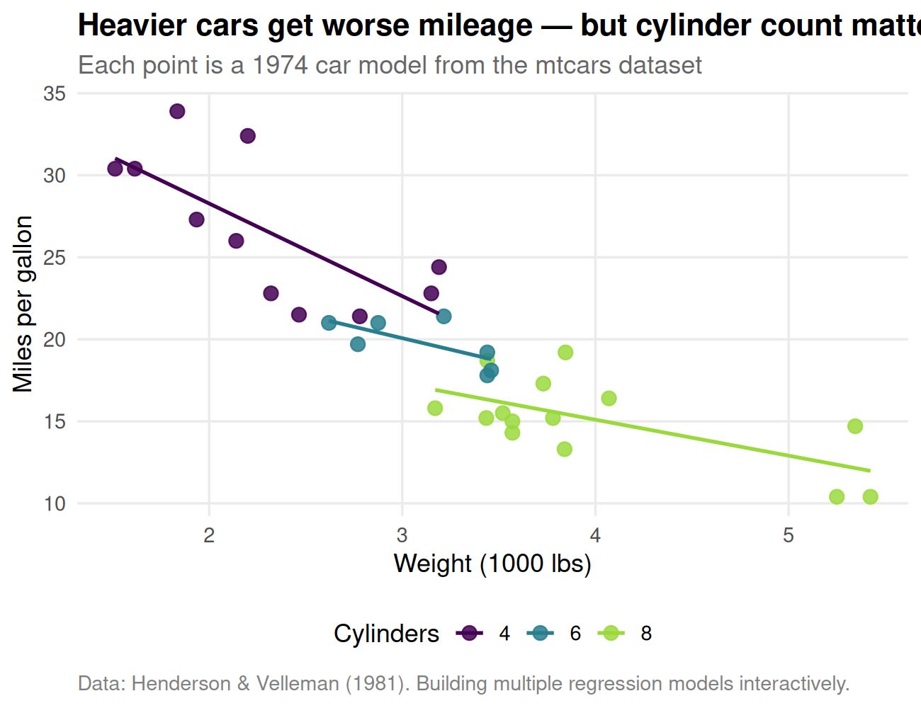
That’s a publication-quality plot in about 20 lines.
Make a scatterplot of hp (x) versus mpg (y)
from cars, with points colored by cyl. Add a
title.
Show solution
ggplot(cars, aes(x = hp, y = mpg, color = cyl)) +
  geom_point(size = 3) +
  labs(title = "Horsepower vs. MPG", x = "Horsepower", y = "MPG", color = "Cylinders")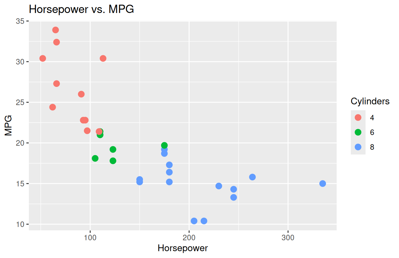
For each transmission type (automatic /
manual), compute the mean MPG. Plot it as a bar chart with
the bar height equal to the mean.
Show solution
cars |>
  group_by(transmission) |>
  summarise(mean_mpg = mean(mpg), .groups = "drop") |>
  ggplot(aes(x = transmission, y = mean_mpg, fill = transmission)) +
  geom_col(width = 0.6) +
  geom_text(aes(label = round(mean_mpg, 1)), vjust = -0.4) +
  labs(title = "Mean MPG by transmission type", x = NULL, y = "Mean MPG") +
  theme_minimal() +
  theme(legend.position = "none")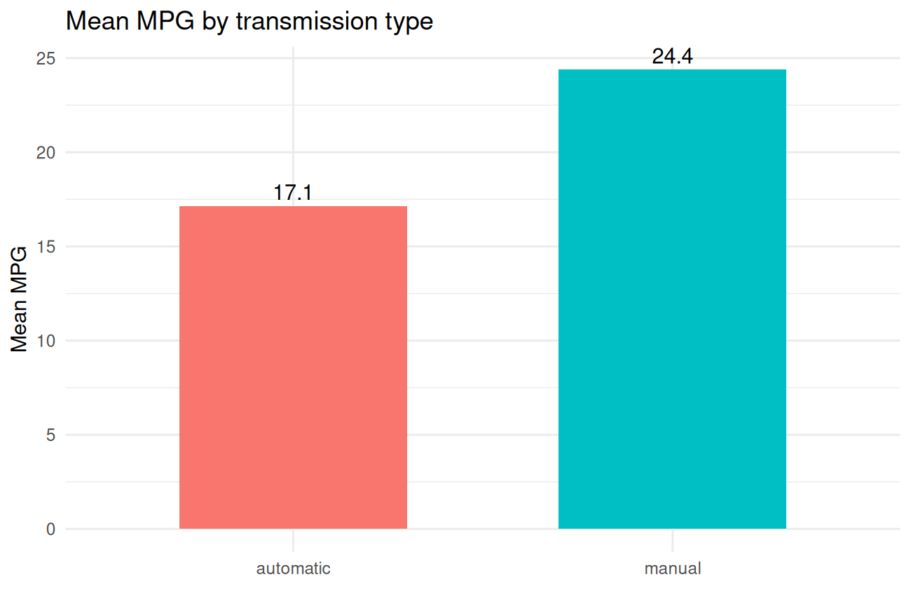
Make a scatterplot of wt vs. mpg, with one
panel per cylinder count, and a linear fit line in each panel.
Show solution
ggplot(cars, aes(x = wt, y = mpg)) +
  geom_point() +
  geom_smooth(method = "lm", se = FALSE) +
  facet_wrap(~ cyl, labeller = label_both) +
  theme_minimal()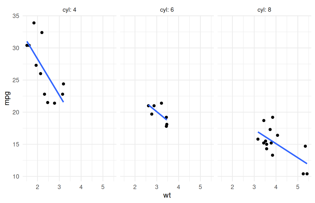
What’s next
You can now turn a data frame into a clear, attractive plot. Combined with Lesson 3, you’ve got a real “explore the data” workflow. Lesson 5 brings in actual statistics — t-tests, correlation, and regression — so you can quantify what your plots are showing you.